ABN AMRO - Rebrand
Client — ABN AMRO
Agency — Ace
Role — Digital & Graphic Design
Team — Rogier Ijzermans, Rogier de Bruin, Vincent Venema, Simon van de Rijdt, Gino van Lierop, Kevin Kikkert, Rob Wienk, John Beckers, Woodwork, Harm Balvers, Kevin van Geest, Ralph Wisburn, Timo van der Braak, Koen de Boer, Pascal Duval, Donald Nolet, Axel van Weel, Matchteld van Woensel Kooy, Mirelle Schelvis, Ingrid te Raaij, Sylvia Keizer, Judith Kampman en Kiek Beljaars.
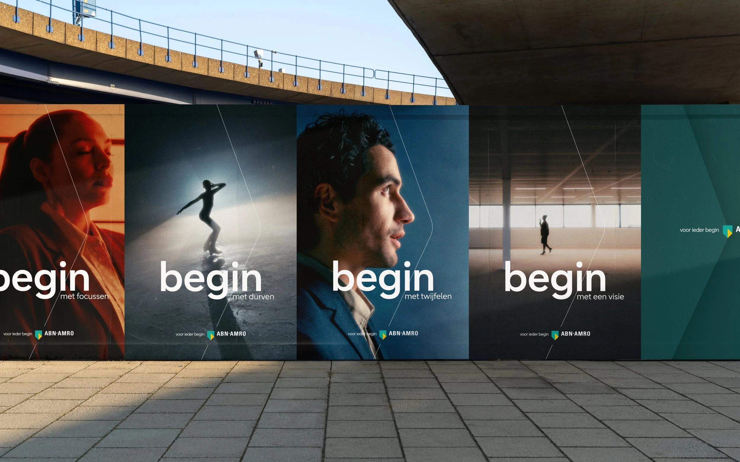
Collaborating with a skilled team and leveraging my role as a designer, we crafted ABN AMRO's new brand identity. Drawing inspiration from its esteemed 200-year legacy, we meticulously tailored it to resonate with the modern era.
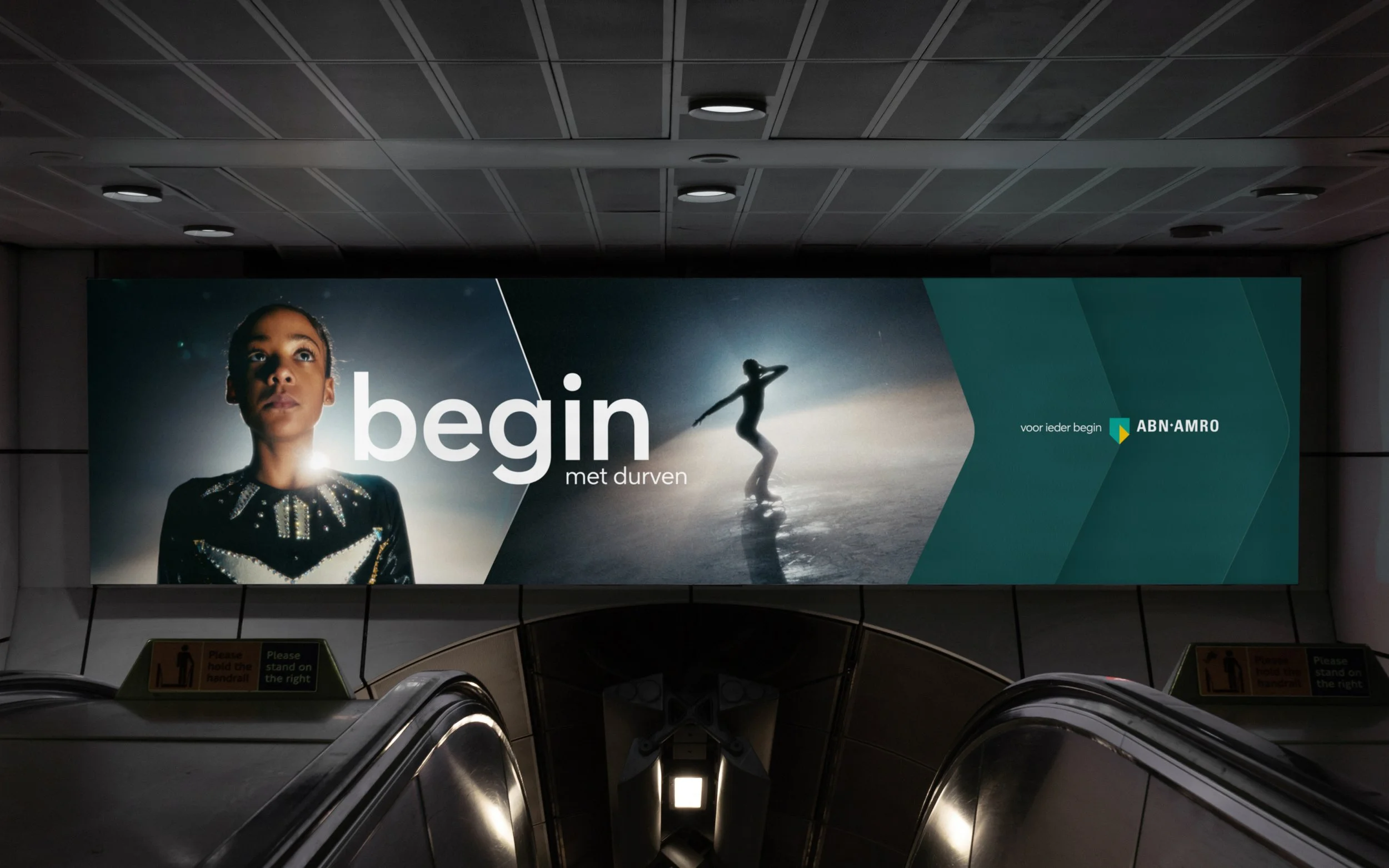
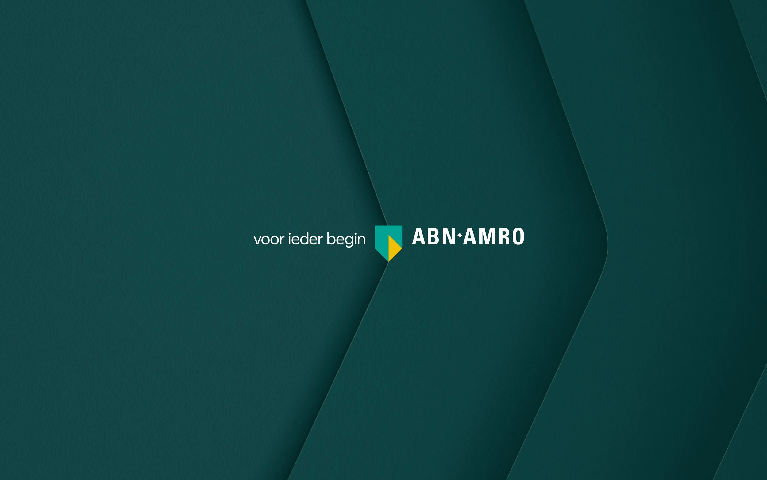
Introducing the new tagline "Voor ieder begin," we unveiled ABN AMRO its refreshed brand identity, underlining its dedication to empowering individuals to start anew. Our approach to the brand identity was to evoke emotion, capturing moments of breakthrough, excitement, and entrepreneurial spirit. Central to our design concept is the graphic element: of the Ripple, inspired by ABN AMRO's shield. Representing drive and accelerating energy, the Ripple is utilized in various forms, including repeating patterns, cut-outs, layouts and animation. It embodies the forward energy of the brand, akin to a ripple in water, growing larger and rounder with each iteration. This visual metaphor reflects the commitment to making ABN AMRO's world more human, open, and accessible.
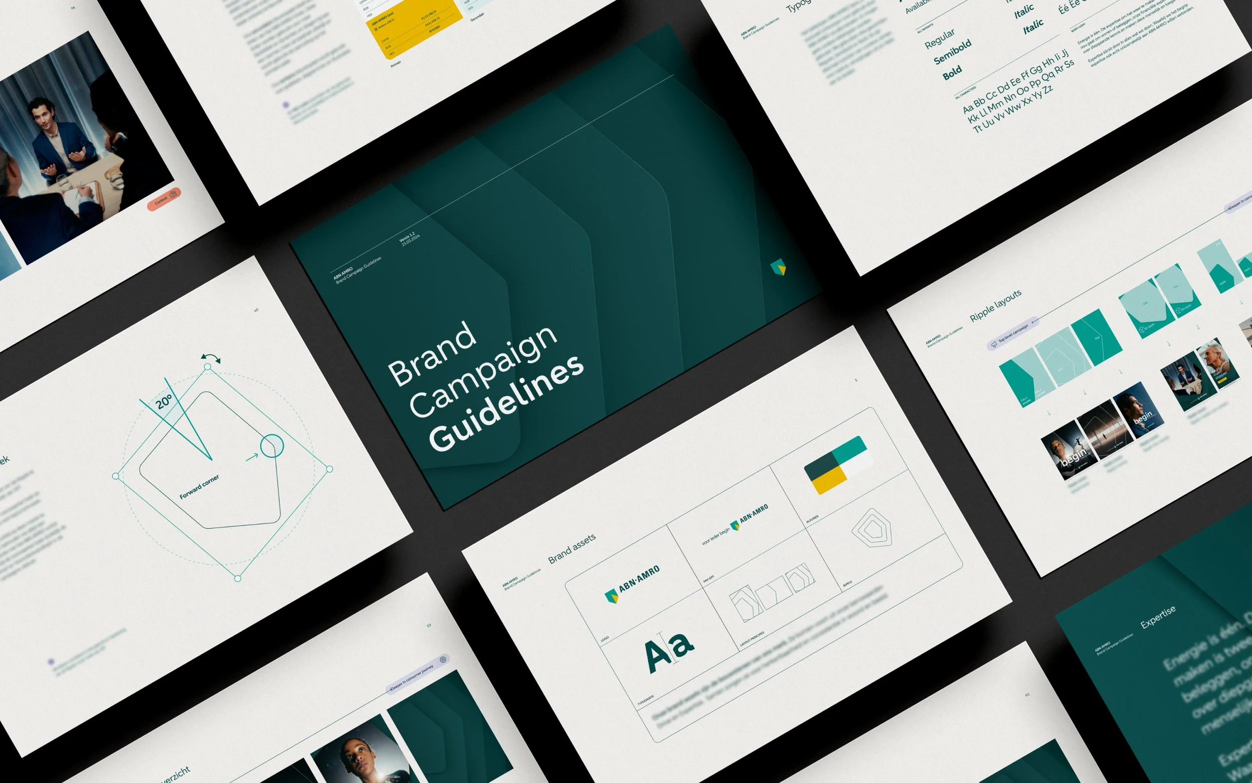
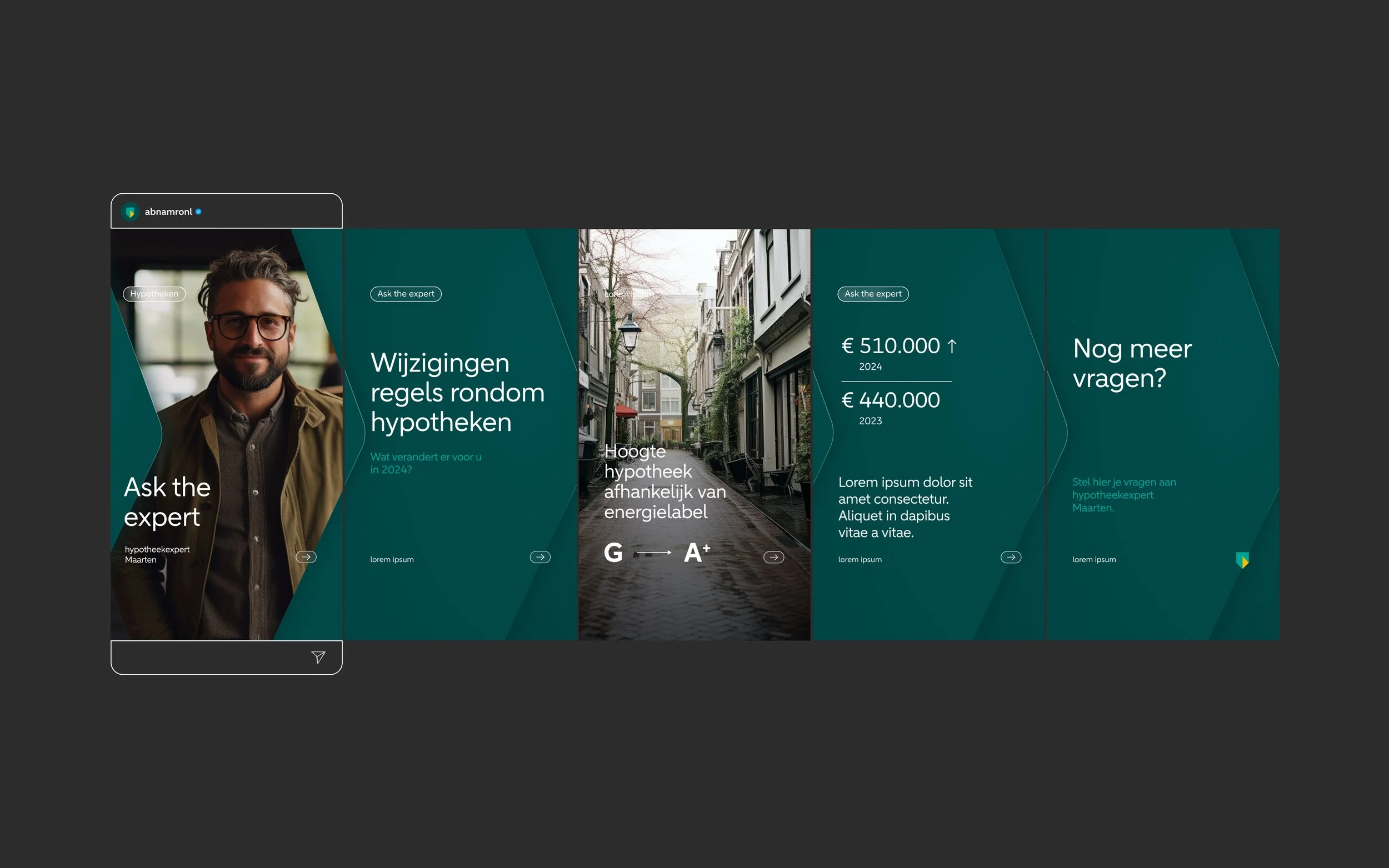
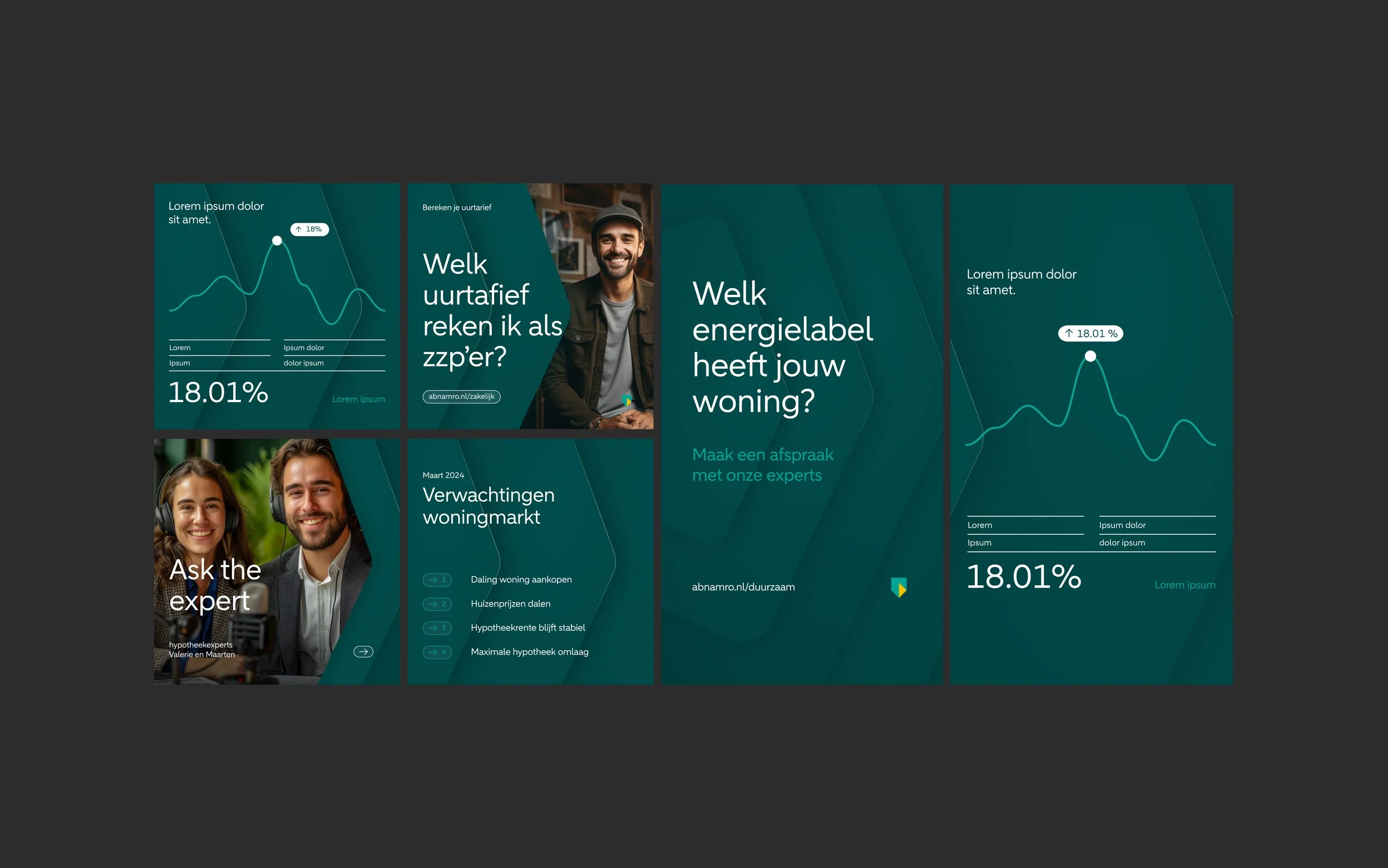
Alongside the visual elements, we carefully developed detailed visual identity guidelines. These cover layouts, lockups, color schemes, typography, graphic components, sizing, and more to ensure uniformity and coherence across all brand representations. We also created social media and video guidelines, along with templates, for others to work with.
